

Projectenbound
Brand Design + Art DirectionDescriptionEnbound is a technology-enabled B2B marketing studio that leverages automated intelligence and automation to optimize GTM for growth-stage companies. Their target audience includes enterprise level or VC-backed startups, and they want to stand out visually as sleek & modern with a tinge of funk. Enbound is the new Gen Z kid on the Fintech block.

Primary Logo
The primary logo is a wordmark which clearly states the brand’s name and its sleek and modern aesthetic. The connected typography symbolizes dependability and support.
Color Palette
Submark
This Submark eminates modernity with its simplicity. Under certain circumstances the Submark can be used on its own instead of the Primary Logo mark.Typography

The color palette’s blues and grays represent the brand's modernity and sleekness. The Lilac can be brought in as a secondary color for a pop of softness. Brand Mission
Exemplifies the typography utilized for headlines

The balance of the sans-serif body font with funky primary font, Grotta, hints at the brand’s modernity with a tinge of youth. They're the new Gen Z kid on the block.Graphic Elements

Photography
Photography should evoke a sleek, modern, and industrial feeling. Imagery of water and light will serve as symbols for the company's adaptability and fluidity.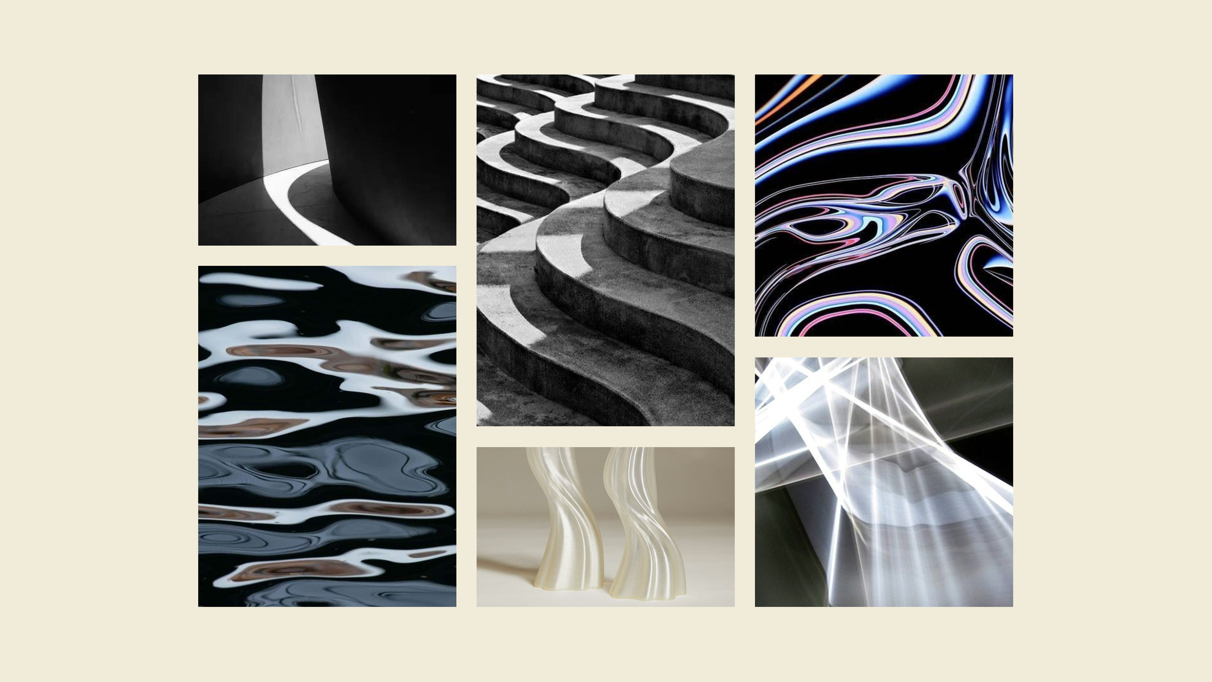
Art Direction
Our visual art direction constantly strikes a balance between utilitarian and elegant with elements compromised of gradients, textures, imagery with rounded square edges, and soft illustrations.


Web Design
Displays the brand's graphic elements, jersey design, brand mission, and photography.Instagram Stories
Social Feed
