

ProjectLoisaida Ladies Football Club
Brand Design + Art Direction + Apparel DesignDescriptionBrand identity, art direction, and kit design for a Lower East Side grassroots female football club that promotes active and accessible community building through outdoor play.
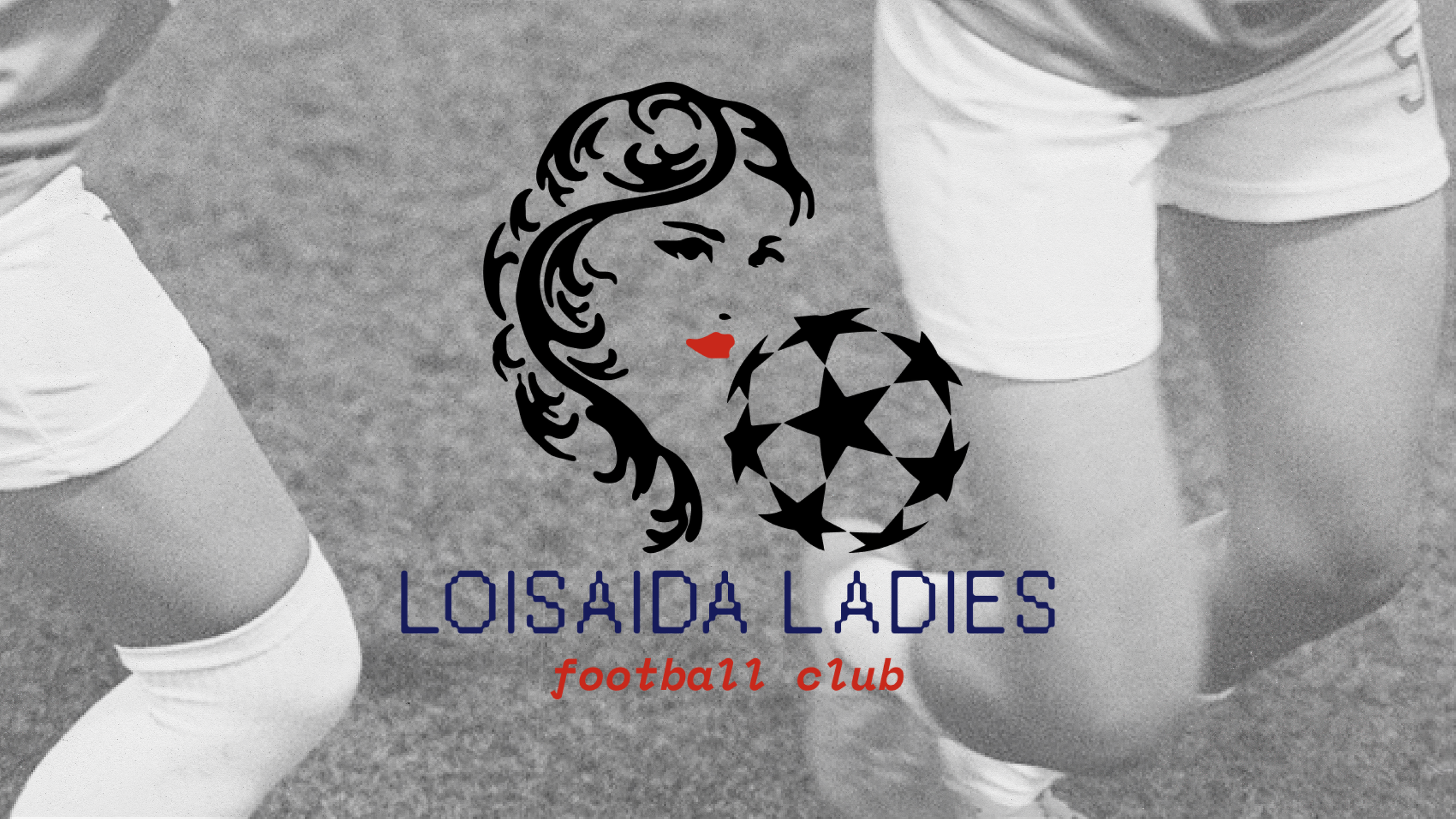
Primary Logo
The primary logo combines the sub mark with the word mark to clearly communicate that Loisada Ladies FC is a female football team. Submark
The submark was inspired by the typical beauty salon female iconography, seen heavily throughout the neighborhood, in combination with a starred soccer ball. 
Wordmark
The word mark utilizes contrasting typefaces to hint at the club's aggressive yet supportive nature.
Color Palette
Inspired by the Puerto Rican Flag colors — a flag seen throughout the neighborhood due to the historical demographic of the neighborhood being of the Puerto Rican diaspora.Brand Mission
Exemplifies the typography utilized for headlines

Typography
The headline typography juxtaposes an elegant italic font with a rugged sans-serif. The rugged typeface draws inspiration from the history of the neighborhood being resided by garment workers.
Web Design
Displays the brand's graphic elements, kit design, brand mission, and photography.
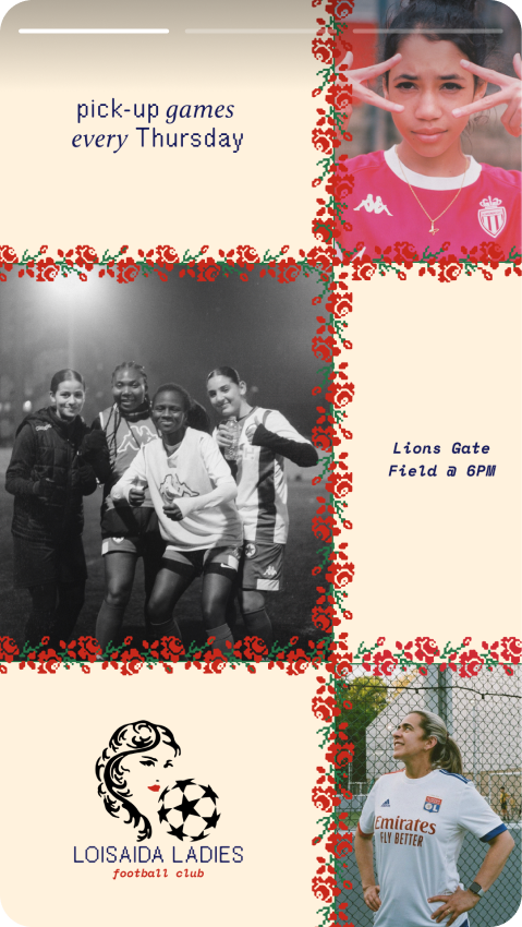
Social Posts
A whole package of graphic elements such as embroidery-inspired iconography and brand textures were made for the brand and utilized across social media posts.


Instagram Stories
Instagram stories display the graphic stickers which hint at local Lower East Side / NYC symbols like the slice of pizza, the pigeon, and the neighborhood's Williamsburg Bridge.

Jersey/Apparel Design
The away jersey displays a textile inspired graphic texture that honors the textile and garment workers who built the neighborhood to be what it is today. The home jersey utilizes a graphic rose as a sleeve trim to pay tribute to the New York state flower.